This website uses cookies in order to enhance the overall user experience.
Because of the vast development of mobile devices, the last years have made responsive web design a core concept in the internetworld. Its significance is huge, because people increasingly visit websites via (small) mobile devices. Simultaneously, computer and television screens are generally increasing in size. Thus, in their design of a website, designers cannot just keep standard screen resolutions in mind, but have to create designs that are responsive to each type of screen.
Looking for online success?
We are curious to hear your story! What does your organization do, and what is your mission?
We love to look at how you can achieve (even more) online success, and how we can help you realise this.
info@rminds.nl
or call us on
+31 (0)6 156 447 86
A responsive design improves your Google rank
Since November 2014, Google has been rewarding all mobile-friendly websites with the mention “For mobile.” Users who use Google on their smartphone or tablet and see your website among the search results will know that your website is suitable for mobile, which directly increases the chance that they will click through to your website.
An important element to keep in mind with responsive web design is the use of web forms. Computer users have a keyboard, which allows them to fill in a form in no time since typing is only a small effort. However, smartphone users are not waiting to do a lot of typing. In addition, forms work technically different on many mobile devices and in some cases they even become unusable. You can therefore ask yourself whether it is wise to let smartphone users fill out a web form in the first place. In many cases it is better to offer them an option to send their details per e-mail.

Design according to your branding
In our website development, we always make sure that it is easy to use. Your website can be delivered in Joomla, Drupal, or (custom) CMS of your choice. In this, we will integrate your CMS with the right plug-ins so you can realize your goals and easily manage your own website.

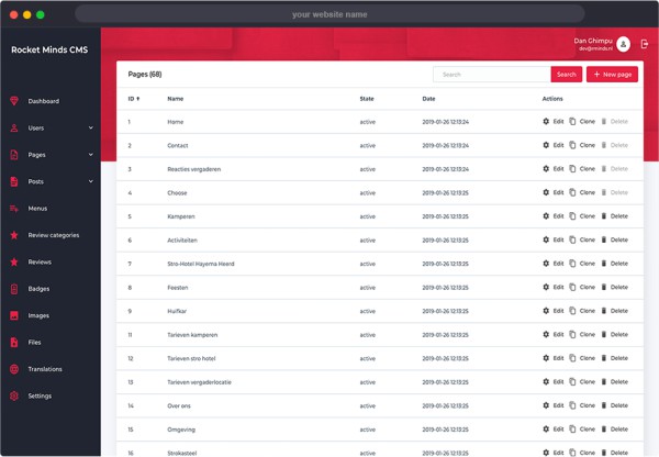
Easy management system (CMS)
Depending on your wishes, the cheapest option is to let us develop your website with a custom CMS tailored to your specific needs.

Modules & functionalities
There is more to the development of a professional website that just the integration of a CMS and the creation of a conversion oriented design. In order to interact (communicate, sell, convince) with your visitors, the website can be integrated with chat or ticket services, a payment system, or any other module that facilitates visitor interaction.

SEO & visibility
After the website is delivered, you will always receive additional support. Depending on the type of website, you will get instructions on how to use your CMS, how to work with the links and tools that are integrated, and about the other services that your website relies on.
Adaptive webdesign
When we talk about the way a device is used and about contextual factors such as time and location, we are not talking about responsive web design anymore. In this case, we are talking about adaptive web design, and although there is often confusion between these 2 terms, adaptive web design simply goes a step further. With adaptive web design, the functionality of your website can also adapt to the user based on the time or location of the visit, and hence allows you to address your visitors even better.
With adaptive web design, you can for example offer your visitors to display the website in their own language, tell them whether their location is eligible for free shipping or show them a timer for how long a certain promotion will continue to run for.
Website optimization
There are many facets to optimizing a website: technical optimization, conversion oriented designing, and of course Search Engine Optimization (SEO) and Search Engine Advertising (SEA). How do we at Rocket Minds go about this and how do we lead your website or webshop to success? Click underneath to read all about it!.

SEO and SEA
Search engine marketing is a process that progresses slowly. However, when you choose to involve our SEO and SEA specialists, then you can be sure that you will reap the benefits of increased website traffic over time.

Google AdWords
Google's search results are not just indexed by algorithms, but also paid for as online ads. Google AdWords – also known as Search Engine Advertising (SEA) – allows you to directly attract visitors from Google's first page without having a completely optimized website.

More conversions
After you attract website visitors, these have to be converted to leads, clients or customers. At Rocket Minds we create conversion oriented designs: geared towards a clear goal, with tactical implementations of Call to Actions, buttons, and other functionalities.

Content optimization
When the technical optimization is done, we can focus us on the other element of SEO, namely content optimization. In this, we analyze keywords to optimize the content (texts, titles, images, videos) of your website.
Free consultation