
Are you about to start a new business? Or do you want to rebrand your existing business?
An important feature to consider is your company logo. A logo is one of the most important identity elements of an organization; it is usually the primary element that people recognize. It is therefore important that your logo corresponds with the imago that you want your business to exude.
-
1Template logo
A fast and affordable approach, but not unique and therefore not recommended.
-
2Font logo
The business and professional style.
-
3Symbol logo
A graphical representation of your company.
-
4Custom logo by sketch
Best choice if you already have some ideas of what you want your logo to look like.
-
5Custom logo (researched)
Let us at Rocket Minds research and design a fitting logo for your company.
Should my organization name be in my logo?
In most cases, we recommend to have the name of your company indicated near or in the logo. Only a few companies succeeded to make their logo recognizable solely by their icon or symbol. Moreover, this only became possible after huge investments in advertising and existing on the marketplace for years already. Successful examples are the Nike symbol, the Windows icon of Microsoft, and Absolut Vodka who made the shape of their bottle widely recognizable by using visual marketing strategies based on the same shape.

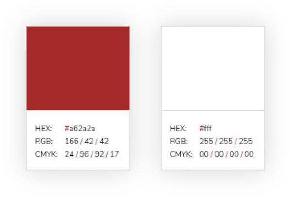
Logo colors
Colors play an important role in exuding a certain corporate identity. Warm colors such as yellow, pink, red, and orange, for example, tend to attract focus. They have a strong “energy” and are perfect for sale-focused marketing strategies. Blue, on the other hand, is more relaxed and conservative. The blue color is soft to the human eye and is associated with high standards and represents a business-related approach.
When it comes to your own logo, thinking about the right color to represent your organization identity is a good start. Colors make a logo easier to memorize. Think about it, Kodak is yellow, Coke is red, Pepsi is blue, PostNL is orange, and FedEx is red and purple. Color can bring the identity of your brand into life, but always make sure that you don't use the same colors as your competitors.
So what is the deal with logos that only use the initials of the name?
That primarily depends on how people memorize and get used to saying the name of your organization. General Electric, for example, is a long name so GE is an excellent logo. GE, meanwhile, is also considered as a nickname for the organization. The same concept applies to FedEx instead of Federal Express, or IBM for International Business Machines. So how do you think people will interpret the name Minnesota Mining and Manufacturing? To make it easier to memorize, they effectively branded it as 3M Company.
A nickname is what people like to call you, so never try to force it. If people want to use your full name, then this is the name that your logo should represent. “Metropolitan Life” can be “MetLife,” but “New York Life” will always stay “New York Life”.

Do you have a question about logos or do you want a quote for the (re)design of your own logo or company identity?
Reach out to us or leave your contact details here so we can call you back.